TMA Design Guidelines
Starting with version 6.10, Telegram has updated the color palette for Mini Apps: a couple of old ones were fixed, and new ones were added.
For context let's remember the history of updates.
Changelog.
- The
bg_colorandsecondary_bg_colorhave been updated.
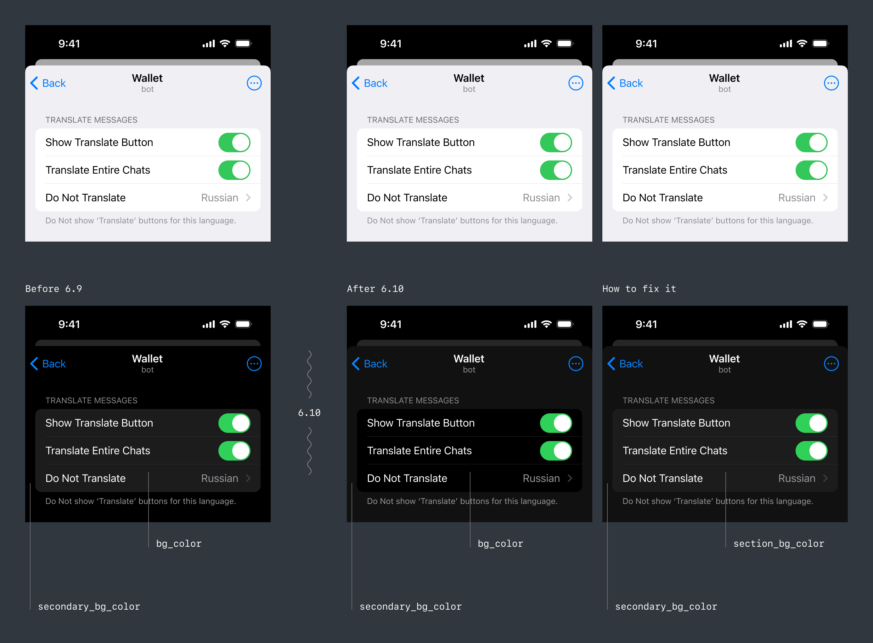
What are the reasons:
• These colors were originally intended for use on page backgrounds, not UI controls.
• Therefore, for consistency, they have been updated.
• To color the backgrounds of different sections and cards, section_bg_color was added.
To improve the appearance of your applications, you should slightly adjust the use of color variables.
Above is a clear example that explains exactly what will change for iOS. There should be no changes on Android.
New colors. Also, many new colors were added. Most of them are most noticeable on Android. Therefore, the examples below will be shown based on Android, but are relevant for all platforms.
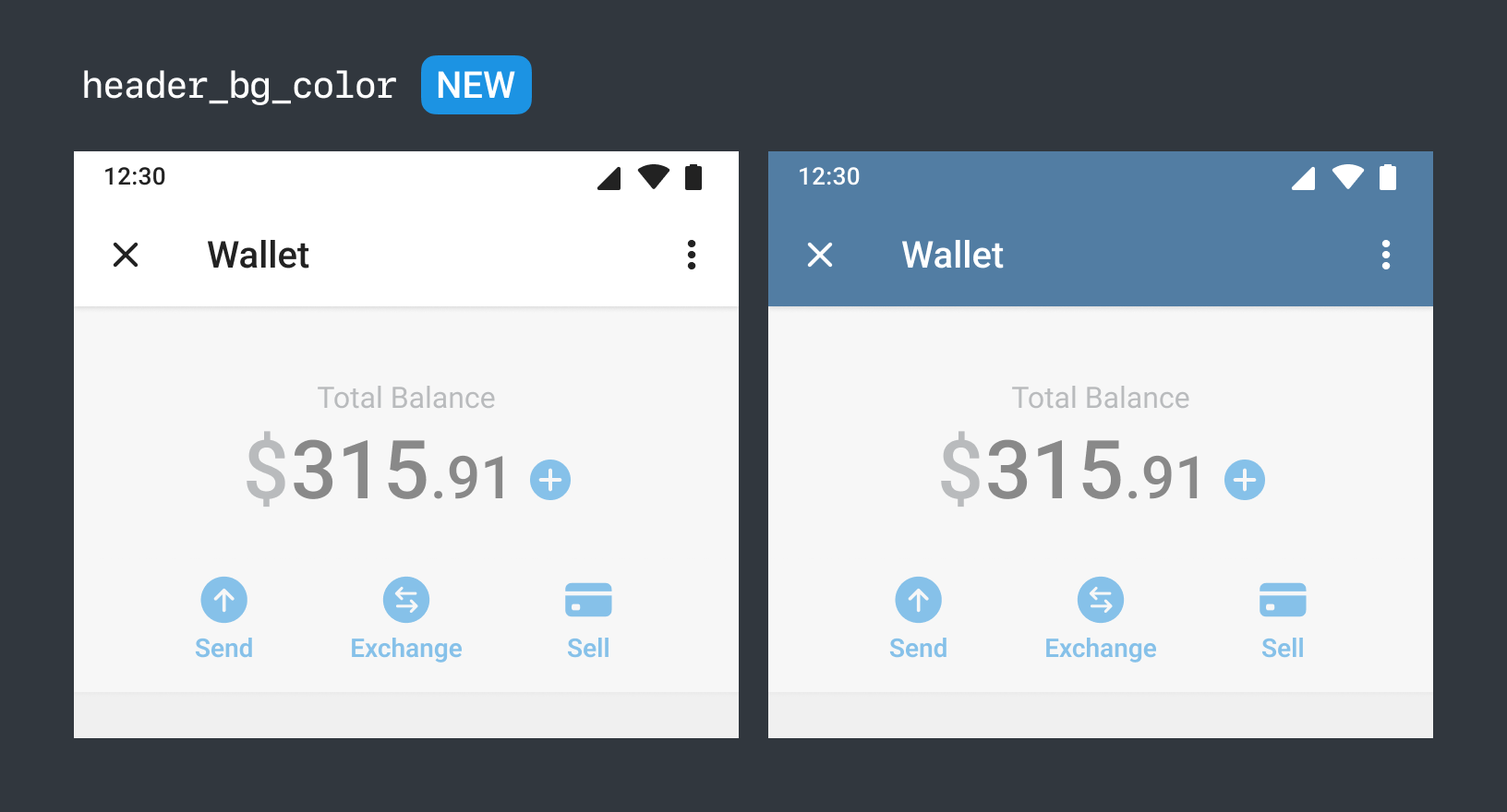
- For Mini Apps, the ability to use Telegram header colors has become available.
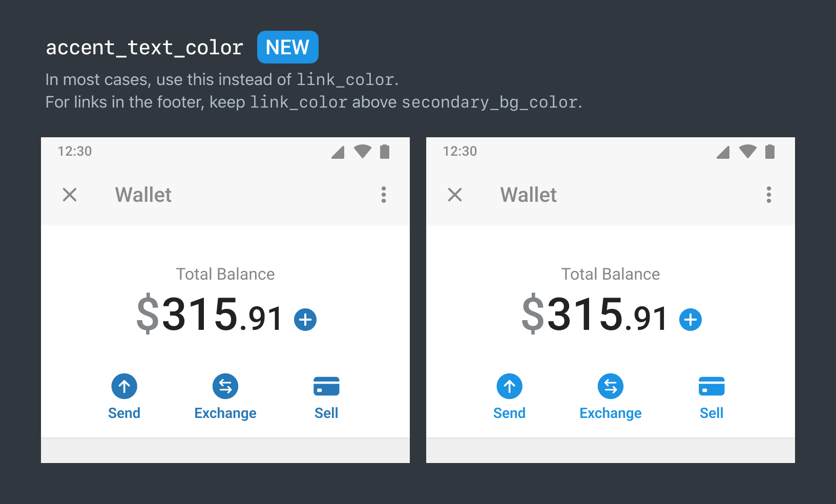
- The token accent_text_color has become available, which is useful for any accent elements in your applications. Previously, everyone used the less suitable dark link_color.
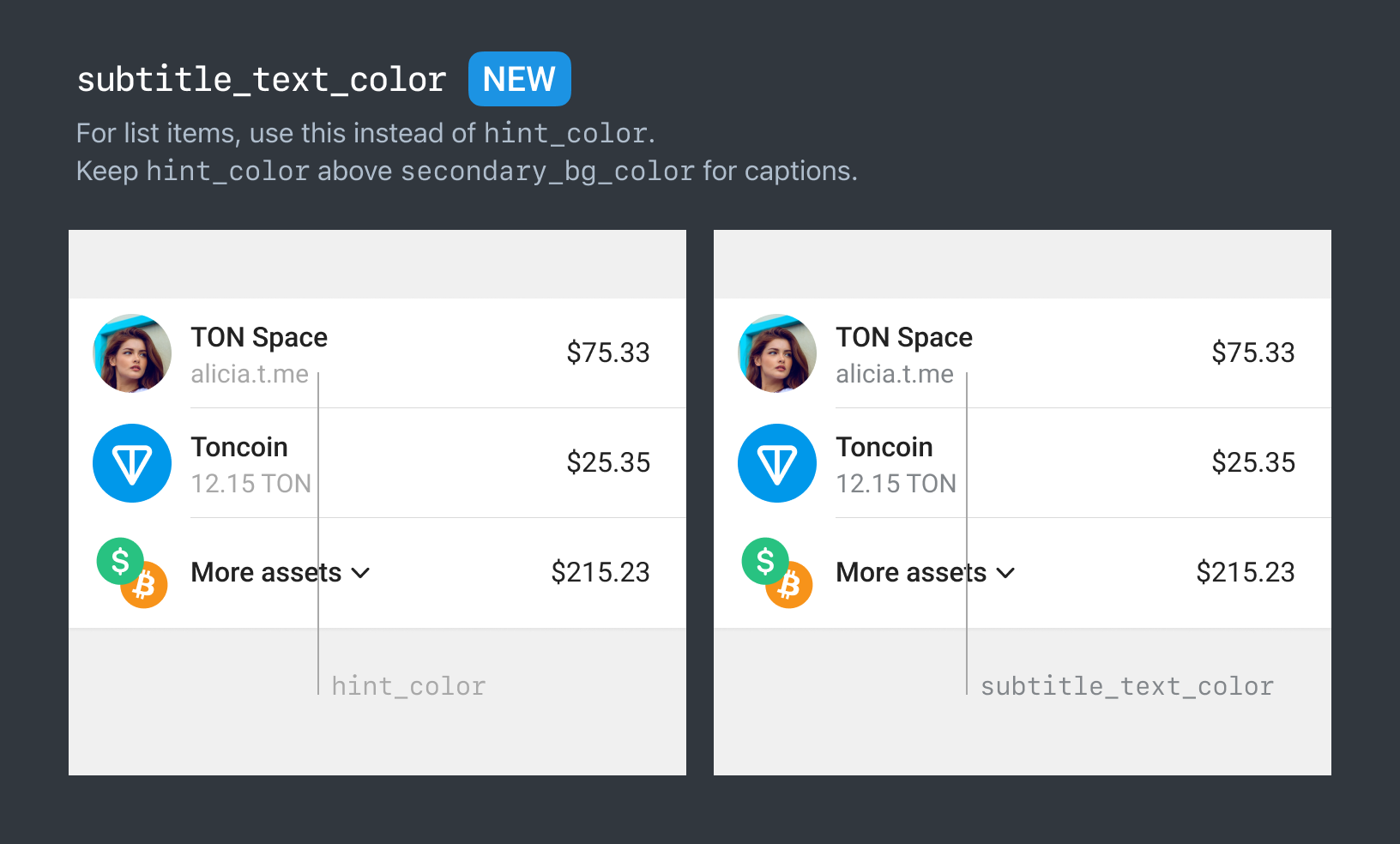
- For all secondary cell labels, it's now better to use
subtitle_text_color. This will allow for more contrasting label, improving the accessibility of your applications.
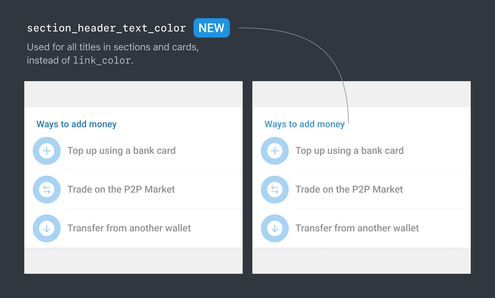
- For section headers of cards, there is now a dedicated token:
section_header_text_color.
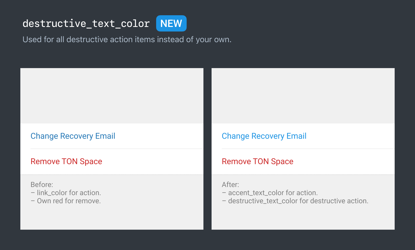
- For cells whose pressing will lead to a destructive action, you can now use
destructive_text_colorinstead of custom ones.
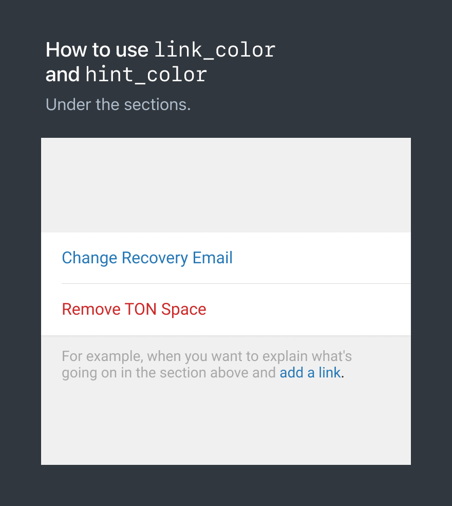
- A reasonable question arises: how should
link_colorandhint_colorbe used now?
I recommend using them as colors for hint sections under the sections, and the link color for such backgrounds as secondary_bg_color.